Components
All components are headless by default — they render semantic HTML with data-sr-* attributes you can target with CSS. All components automatically adapt to the shop’s rating type (stars or thumbs) with no manual configuration needed.
Default Styles (Optional)
Ship with polished defaults in one line. Every rule uses :where() for zero specificity, so any custom CSS you write wins automatically — no !important needed.
import '@simplersuite/react/styles.css';The default theme uses CSS custom properties you can override:
:root { --sr-primary: #8b5cf6; /* Buttons, links, accents */ --sr-star: #ec4899; /* Star fill color */ --sr-radius: 8px; /* Border radius */ --sr-thumb-up: #16a34a; /* Thumbs up color */ --sr-thumb-down: #dc2626; /* Thumbs down color */ /* See styles.css source for all variables */}Or skip the import entirely and style from scratch using the data-sr-* attributes documented below.
ReviewSummary
Displays aggregate rating data for a product. In stars mode, shows the average rating, star display, and 5-bar distribution. In thumbs mode, shows “X% recommend” with a thumb icon and 2-bar distribution (up/down).
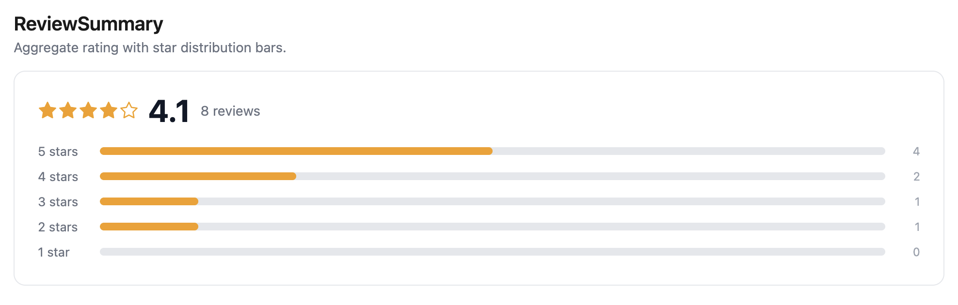
<ReviewSummary productId="7654321098" />Props
| Prop | Type | Default | Description |
|---|---|---|---|
productId | string | — | Shopify product ID (required) |
className | string | — | CSS class name |
renderStars | (rating: number) => ReactNode | — | Custom star renderer |
renderDistribution | (distribution: RatingDistribution) => ReactNode | — | Custom distribution renderer |
Styling
[data-sr-summary] { /* Summary container */ }[data-sr-summary-rating] { /* Average rating row */ }[data-sr-distribution] { /* Distribution bars container */ }[data-sr-distribution-row] { /* Single distribution row */ }[data-sr-distribution-label] { /* Row label (e.g. "5 stars") */ }[data-sr-distribution-bar] { /* Bar track */ }[data-sr-distribution-fill] { /* Bar fill */ }[data-sr-distribution-count] { /* Row count */ }[data-sr-empty] { /* Empty state (no reviews) */ }ReviewList
Displays paginated reviews with a “Load More” button. Automatically renders stars or thumbs per review.
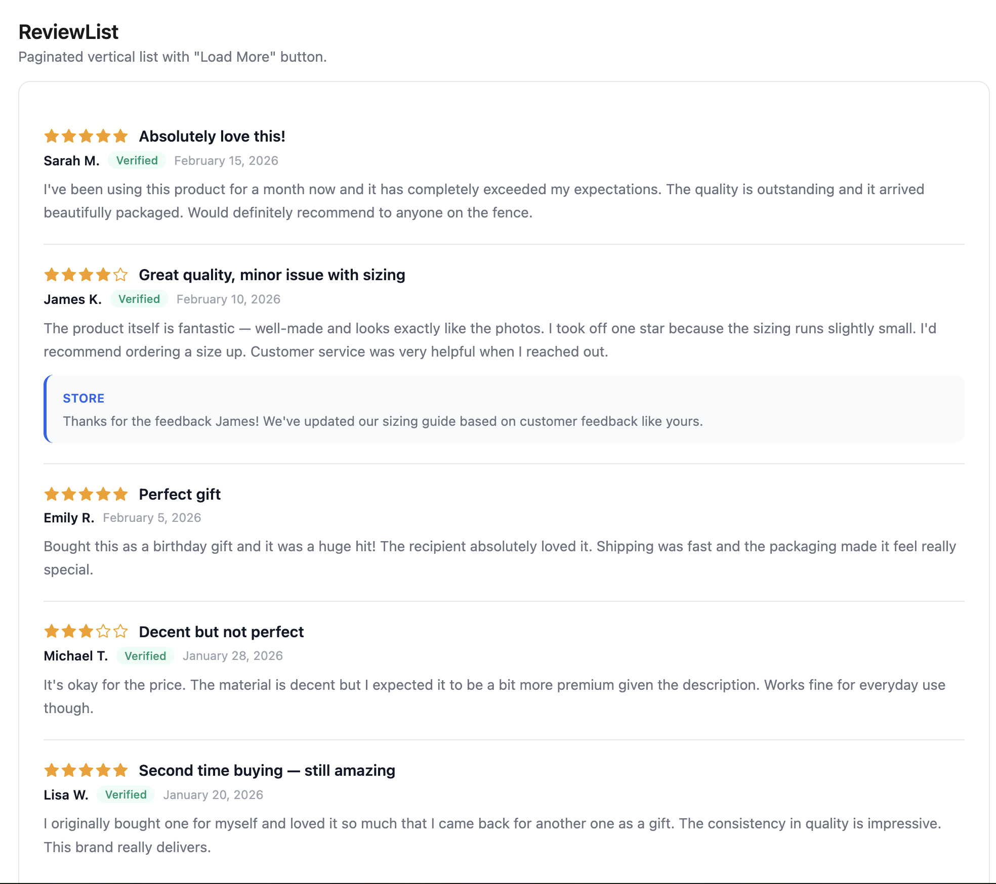
<ReviewList productId="7654321098" perPage={5} sort="newest" />Custom rendering:
<ReviewList productId="7654321098" renderReview={(review, index) => ( <div key={review.id}> <strong>{review.author.name}</strong> <p>{review.body}</p> </div> )}/>Props
| Prop | Type | Default | Description |
|---|---|---|---|
productId | string | — | Shopify product ID (required) |
perPage | number | 10 | Reviews per page |
sort | ReviewSortOption | "newest" | Sort order: newest, oldest, highest, lowest, most_helpful |
renderReview | (review: Review, index: number) => ReactNode | — | Custom review renderer. When omitted, the default layout is used. |
className | string | — | CSS class name |
Styling
[data-sr-review-list] { /* List container */ }[data-sr-review] { /* Individual review article */ }[data-sr-review-header] { /* Review header (rating + title) */ }[data-sr-review-title] { /* Review title */ }[data-sr-review-body] { /* Review body text */ }[data-sr-review-meta] { /* Author, date, verified row */ }[data-sr-review-author] { /* Author name */ }[data-sr-review-verified] { /* Verified purchase badge */ }[data-sr-review-date] { /* Review date */ }[data-sr-review-photos] { /* Photo gallery container */ }[data-sr-review-reply] { /* Merchant reply block */ }[data-sr-review-reply-author] { /* Reply author name */ }[data-sr-review-reply-body] { /* Reply text */ }[data-sr-load-more] { /* Load more button */ }[data-sr-loading] { /* Loading indicator */ }[data-sr-empty] { /* Empty state */ }[data-sr-error] { /* Error state */ }ReviewCarousel
Horizontal carousel for browsing reviews with page-based navigation. Arrows and dots advance by a full page (the number of visible cards). Supports touch swipe, keyboard navigation (ArrowLeft/ArrowRight), and auto-play.
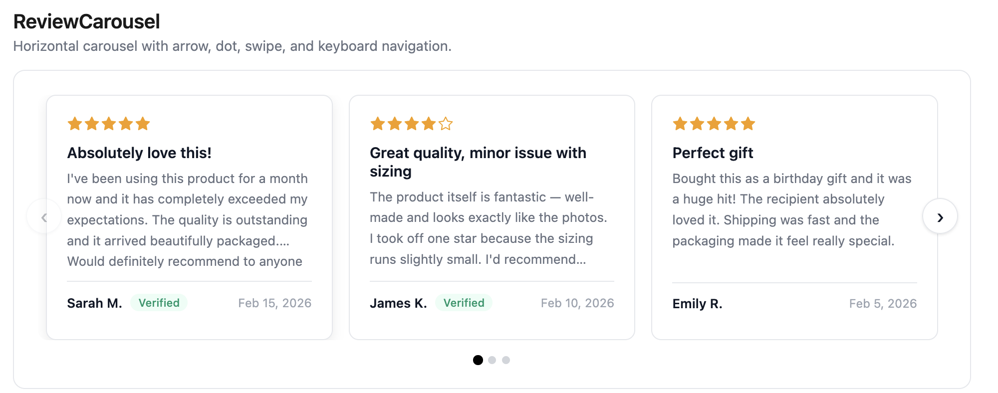
<ReviewCarousel productId="7654321098" visibleCount={3} />With custom renderReview:
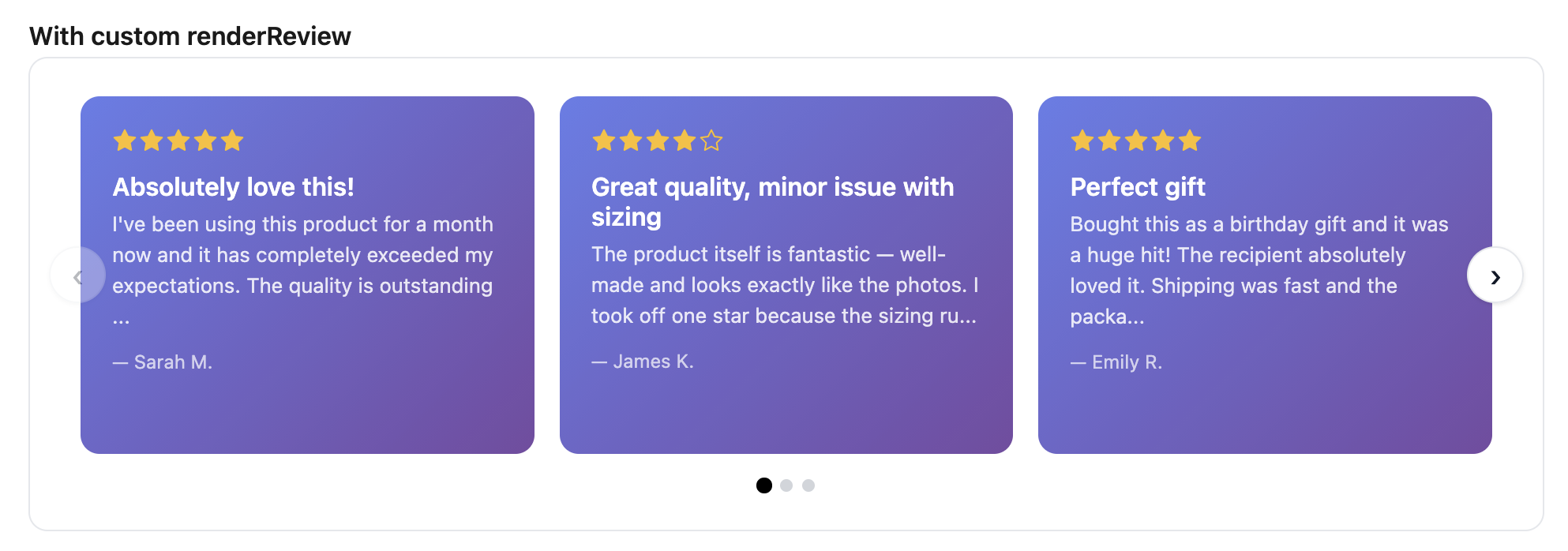
Auto-play with custom rendering:
<ReviewCarousel productId="7654321098" autoPlay autoPlayInterval={4000} renderReview={(review) => ( <div key={review.id}> <h3>{review.title}</h3> <p>{review.body}</p> </div> )}/>Customized navigation:
<ReviewCarousel productId="7654321098" showDots={false} prevIcon={<span>←</span>} nextIcon={<span>→</span>}/>Dots only (no arrows):
<ReviewCarousel productId="7654321098" showArrows={false} dotActiveColor="#2563eb" dotInactiveColor="#e5e7eb"/>Props
| Prop | Type | Default | Description |
|---|---|---|---|
productId | string | — | Shopify product ID (required) |
perPage | number | 10 | Number of reviews to fetch |
visibleCount | number | responsive | Cards visible at once. When omitted, auto-calculates: 1 on mobile, 2 on tablet, 3 on desktop. |
sort | ReviewSortOption | "newest" | Sort order |
autoPlay | boolean | false | Auto-advance pages |
autoPlayInterval | number | 5000 | Auto-play interval in ms. Pauses on hover. |
renderReview | (review: Review, index: number) => ReactNode | — | Custom review card renderer |
className | string | — | CSS class name |
showArrows | boolean | true | Show prev/next arrow buttons |
showDots | boolean | true | Show page dot indicators |
dotActiveColor | string | "currentColor" | Color of the active page dot |
dotInactiveColor | string | "#d1d5db" | Color of inactive page dots |
prevIcon | ReactNode | ‹ | Custom content for the previous button |
nextIcon | ReactNode | › | Custom content for the next button |
Styling
[data-sr-carousel] { /* Carousel container (focusable for keyboard nav) */ }[data-sr-carousel-viewport] { /* Visible window (overflow: hidden) */ }[data-sr-carousel-track] { /* Sliding strip of cards */ }[data-sr-carousel-card] { /* Default review card */ }[data-sr-carousel-prev] { /* Previous page button */ }[data-sr-carousel-next] { /* Next page button */ }[data-sr-carousel-prev]:disabled { /* Disabled state (first page) */ }[data-sr-carousel-next]:disabled { /* Disabled state (last page) */ }[data-sr-carousel-dots] { /* Dot container */ }[data-sr-carousel-dot] { /* Individual dot */ }[data-sr-carousel-dot][data-sr-active] { /* Active page dot */ }[data-sr-empty] { /* Empty state */ }[data-sr-error] { /* Error state */ }ReviewBadge
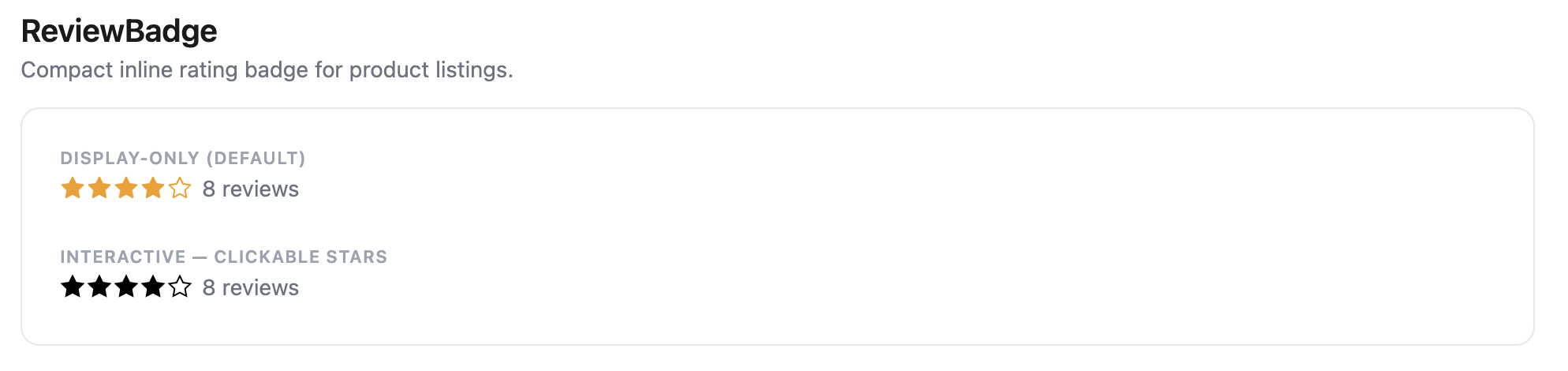
Compact rating badge showing the aggregate rating and review count. Returns null while loading or when a product has 0 reviews.
- Stars mode: shows star display and count. Interactive mode has clickable stars.
- Thumbs mode: shows thumb icon + “X% recommend (N)”. Interactive mode has two thumb buttons.
{/* Display-only — click scrolls to #simplerreviews */}<ReviewBadge productId="7654321098" />
{/* Custom click handler */}<ReviewBadge productId="7654321098" onClick={() => scrollToReviews()} />
{/* Interactive — stars/thumbs are clickable */}<ReviewBadge  productId="7654321098"  interactive  onRate={(rating) => submitRating(rating)}/>
Props
| Prop | Type | Default | Description |
|---|---|---|---|
productId | string | — | Shopify product ID (required) |
onClick | () => void | scroll to #simplerreviews | Called on click |
onRate | (rating: number) => void | — | Called with the rating value in interactive mode |
interactive | boolean | false | Makes individual stars/thumbs clickable |
starSize | number | 16 | Icon size in pixels |
className | string | — | CSS class name |
Styling
[data-sr-badge] { /* Badge container */ }[data-sr-badge-interactive] { /* Interactive variant */ }[data-sr-badge-thumbs] { /* Thumbs mode variant */ }[data-sr-badge-count] { /* Review count text */ }ReviewForm
Review submission form. Automatically detects the shop’s rating type and renders the appropriate input — a 5-star picker for stars mode, or recommend/don’t recommend buttons for thumbs mode.
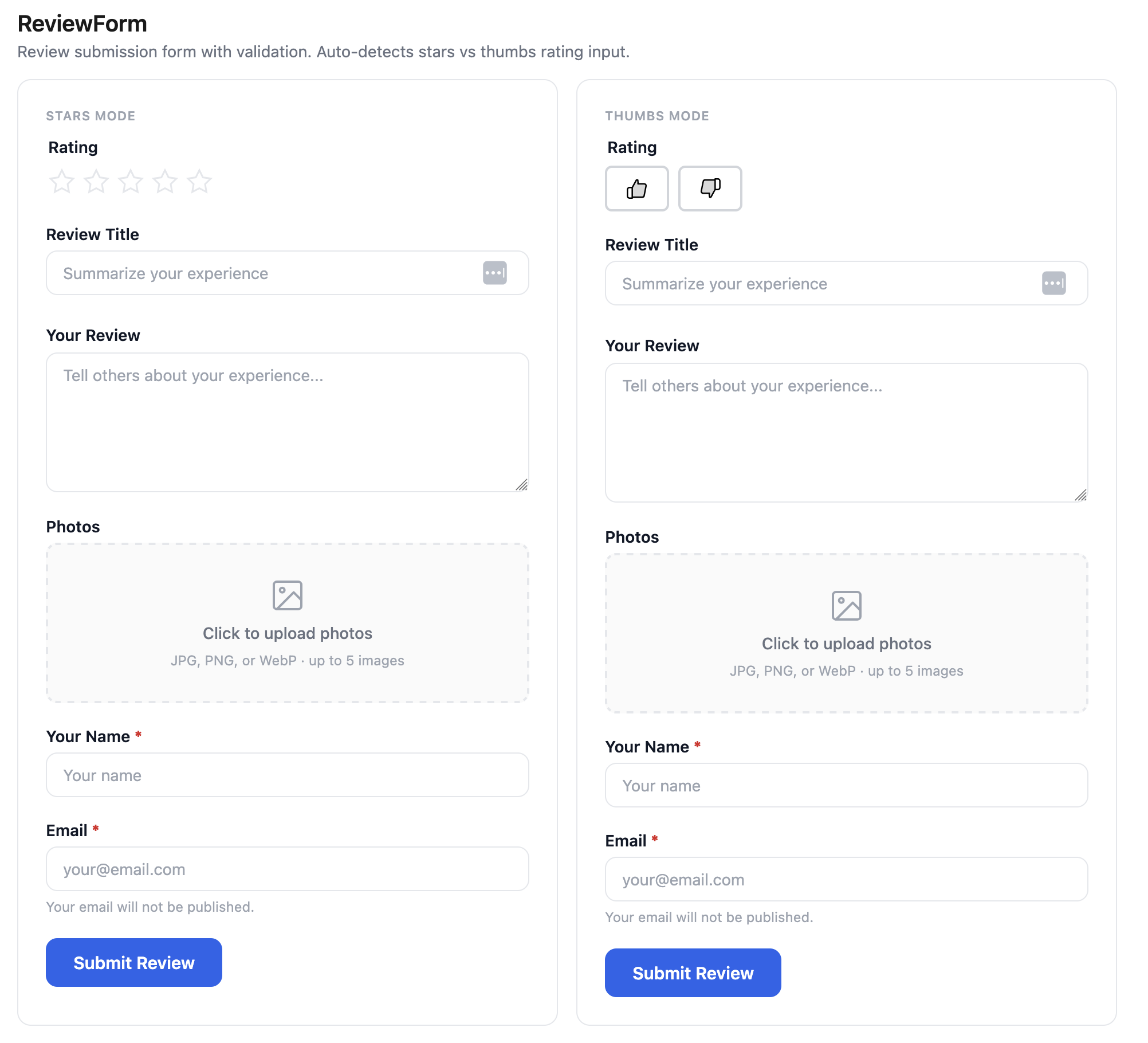
<ReviewForm productId="7654321098" onSuccess={(review) => console.log('Submitted!', review)}/>With visible thumb labels (icon-only by default in thumbs mode):
<ReviewForm productId="7654321098" thumbsUpLabel="Recommend" thumbsDownLabel="Don't recommend"/>Text-only form (no rating input):
<ReviewForm productId="7654321098" showRating={false} onSuccess={(review) => console.log('Submitted!', review)}/>Props
| Prop | Type | Default | Description |
|---|---|---|---|
productId | string | — | Shopify product ID (required) |
onSubmit | (data: SubmitReviewData) => void | — | Called when the form is submitted (before API call) |
onSuccess | (review: Review) => void | — | Called after a successful submission |
showRating | boolean | true | Show the rating input (stars or thumbs). Set to false for text-only forms (testimonials, feedback, Q&A). |
maxPhotos | number | 5 | Maximum number of photos allowed. Set to 0 to hide the upload field. |
thumbsUpLabel | string | — | Visible text label next to the thumbs-up button. Omit for icon-only. |
thumbsDownLabel | string | — | Visible text label next to the thumbs-down button. Omit for icon-only. |
className | string | — | CSS class name |
Styling
[data-sr-form] { /* Form container */ }[data-sr-form-field] { /* Individual form field wrapper */ }[data-sr-form-label] { /* Field label */ }[data-sr-form-input] { /* Text input */ }[data-sr-form-textarea] { /* Textarea input */ }[data-sr-form-submit] { /* Submit button */ }[data-sr-form-error] { /* Error message */ }[data-sr-form-success] { /* Success message */ }ReviewFilters
Sort and filter controls. Adapts to the shop’s rating type — in thumbs mode, shows “All / Thumbs Up / Thumbs Down” instead of star-based filter options.
<ReviewFilters ratingType="stars" onSortChange={(sort) => setSort(sort)} onRatingFilter={(rating) => setRating(rating)}/>Custom sort control:
<ReviewFilters onSortChange={setSort} renderSortControl={({ value, onChange, options }) => ( <select value={value} onChange={(e) => onChange(e.target.value)}> {options.map((opt) => ( <option key={opt.value} value={opt.value}>{opt.label}</option> ))} </select> )}/>Props
| Prop | Type | Default | Description |
|---|---|---|---|
ratingType | "stars" | "thumbs" | — | Adapts filter labels to rating type |
onSortChange | (sort: ReviewSortOption) => void | — | Called when sort changes |
onRatingFilter | (rating: number | null) => void | — | Called when rating filter changes (null = show all) |
renderSortControl | (props) => ReactNode | — | Custom sort dropdown renderer |
className | string | — | CSS class name |
Styling
[data-sr-filters] { /* Filters container */ }[data-sr-filters-sort] { /* Sort control */ }[data-sr-filters-rating] { /* Rating filter buttons */ }ReviewPhotos
Photo grid with lightbox overlay.
<ReviewPhotos photos={['url1.jpg', 'url2.jpg']} />Props
| Prop | Type | Default | Description |
|---|---|---|---|
photos | string[] | — | Array of photo URLs (required) |
className | string | — | CSS class name |
Styling
[data-sr-photos] { /* Photo grid container */ }[data-sr-photo] { /* Individual photo thumbnail */ }[data-sr-lightbox] { /* Lightbox overlay */ }[data-sr-lightbox-image] { /* Lightbox full-size image */ }ReviewStars
Pure display component for star ratings. Does not fetch data — just renders stars.
<ReviewStars rating={4.5} size={20} color="#FFB800" />Props
| Prop | Type | Default | Description |
|---|---|---|---|
rating | number | — | Rating value (1-5, supports decimals for partial stars) |
size | number | 20 | Star size in pixels |
color | string | "currentColor" | Star fill color |
className | string | — | CSS class name |
Styling
[data-sr-stars] { /* Stars container */ }ReviewThumbs
Pure display component for thumbs up/down icons. Supports custom colors, custom icons (any ReactNode), and custom aria labels. All data-connected components (summary, carousel, list, badge) automatically adapt to thumbs mode.
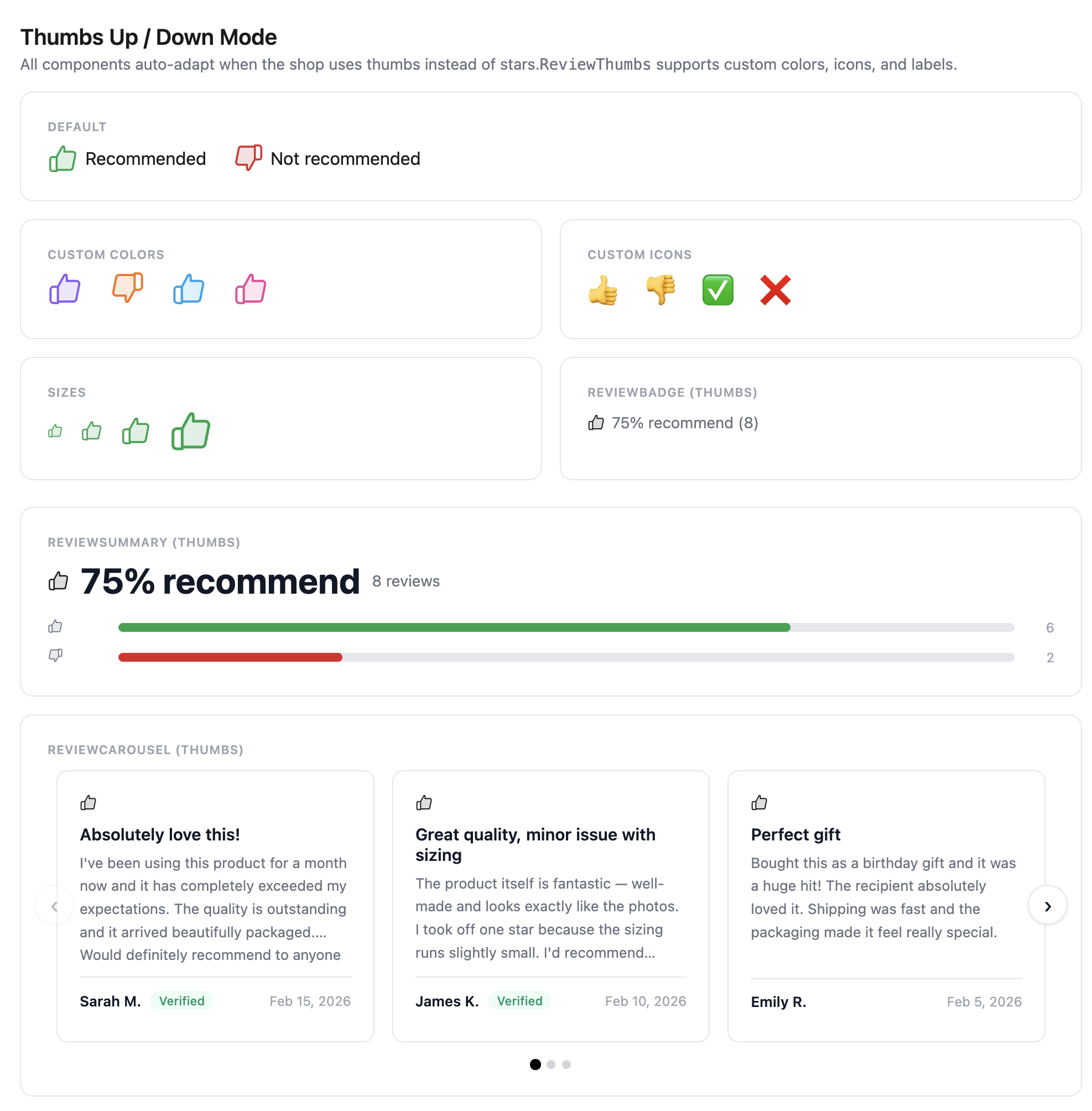
{/* Defaults */}<ReviewThumbs isPositive={true} /><ReviewThumbs isPositive={false} />
{/* Custom colors */}<ReviewThumbs isPositive={true} positiveColor="#16a34a" /><ReviewThumbs isPositive={false} negativeColor="#dc2626" />
{/* Custom icons */}<ReviewThumbs isPositive={true} positiveIcon={<span>👍</span>} />
{/* Custom aria labels */}<ReviewThumbs isPositive={true} positiveLabel="Recommended" />
Props
| Prop | Type | Default | Description |
|---|---|---|---|
isPositive | boolean | — | true for thumbs up, false for thumbs down (required) |
size | number | 20 | Icon size in pixels |
positiveColor | string | "currentColor" | Color when isPositive is true |
negativeColor | string | "currentColor" | Color when isPositive is false |
positiveIcon | ReactNode | — | Custom icon for thumbs up (replaces default SVG) |
negativeIcon | ReactNode | — | Custom icon for thumbs down (replaces default SVG) |
positiveLabel | string | "Thumbs up" | Aria label for thumbs up |
negativeLabel | string | "Thumbs down" | Aria label for thumbs down |
className | string | — | CSS class name |
Styling
[data-sr-thumbs] { /* Thumb container */ }[data-sr-thumbs-positive] { /* Thumbs up variant */ }[data-sr-thumbs-negative] { /* Thumbs down variant */ }ReviewRating
Auto-selecting wrapper that renders <ReviewStars> for stars mode or <ReviewThumbs> for thumbs mode. Useful when building custom review layouts where you don’t want to check the rating type yourself.
<ReviewRating rating={review.rating} ratingType={ratingType} size={16} />Props
| Prop | Type | Default | Description |
|---|---|---|---|
rating | number | — | The rating value (1-5 for stars, 0 or 1 for thumbs) |
ratingType | "stars" | "thumbs" | — | Which display mode to use |
size | number | 20 | Icon size in pixels |
className | string | — | CSS class name |